Rob Cesternino runs a very popular series of reality TV podcasts. He contacted me about redesigning his site.
Rob Has a Podcast
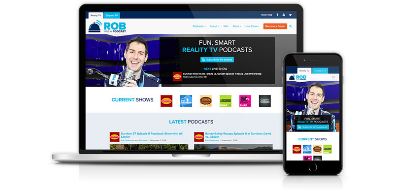
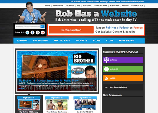
Rob Has a Podcast (RHAP) started as a hobby on Rob’s spare time; over time, both the podcast and the community grew, until he could devote himself full time to podcasting. The original website was several years old and he wanted something cleaner and more professional.
User insights and metrics analysis
RHAP has an extremely engaged community and I was able to gain valuable insights from asking their opinion about the original website. Many of our original suppositions were held up by the community (the site needed to be cleaner, it was confusing to navigate).
However, the research also yielded unexpected results. I’d originally thought that not many people would actually be listening to podcasts on the website because they would simply subscribe on a podcatcher. However, many users wanted to be able to navigate and search for old podcasts on the site and felt it was too difficult. Analytics data confirmed that users’ actions matched their stated opinions.
Defining a MVP
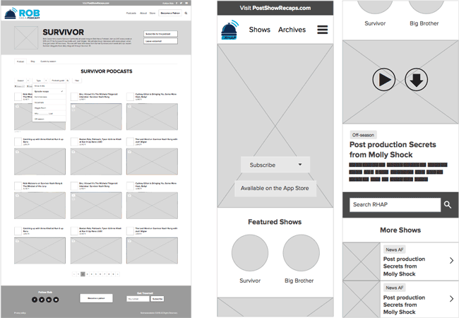
Time was limited because it was early June and the goal was to launch the new website for the start of the new Survivor season in September; this meant some of the ideas I proposed (such as Ajax filtering of shows by seasons and guests, which implied implementing new taxonomies) would necessarily have to be left out of an initial MVP. We agreed that this initial version would launch the new branding that Rob had commissioned, while solving the most pressing issues of users not finding back content through new navigation and better organization. It wold also include a more user-friendly in-site player.
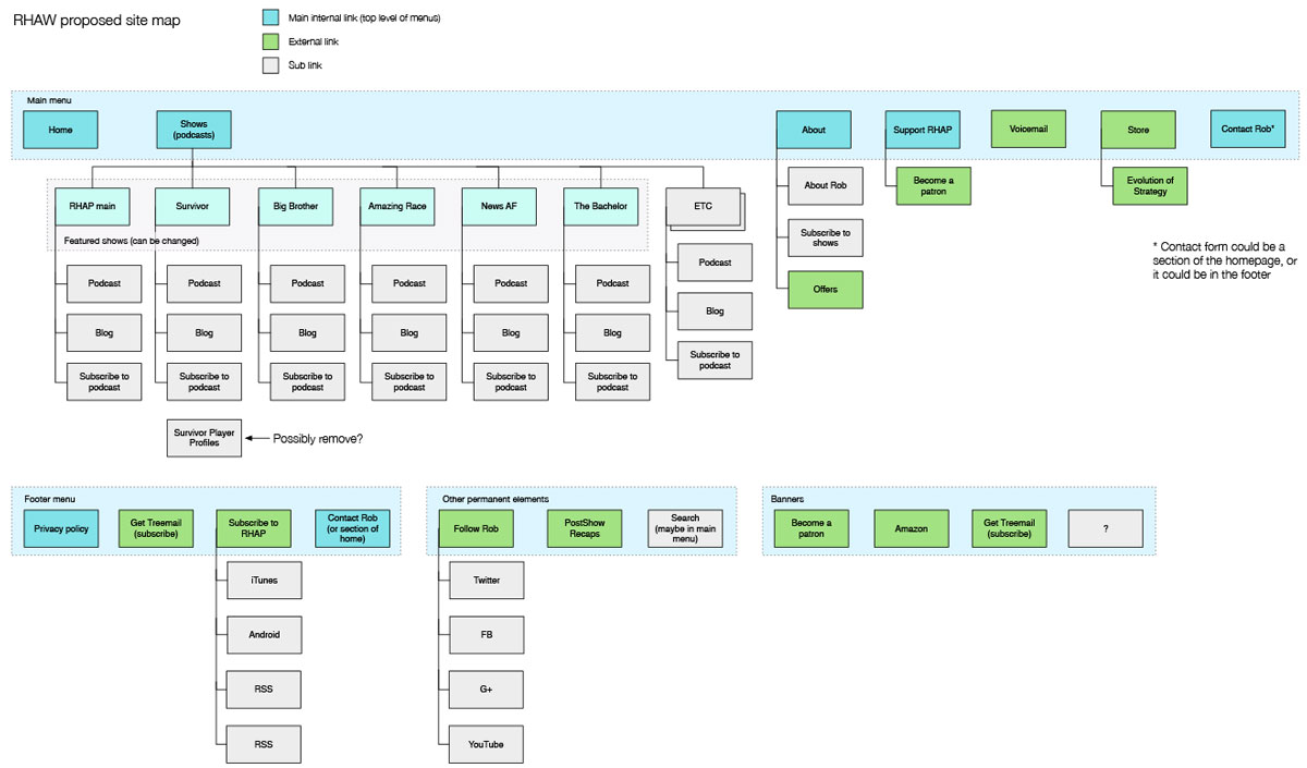
Information architecture
At the time, RHAP had over 2000 podcasts, categorized somewhat haphazardly by show, sometimes by season, and tagging was extremely arbitrary. This contributed to users’ difficulty finding the content they wanted. Defining a new information architecture was extremely important to the redesign.
UX/UI design
The design process was iterative, with weekly meetings to check on progress and course correct if necessary. This process, possible thanks to great communication with a client who knows his product and audience very well, was an extremely enriching experience.
Validating new design with users
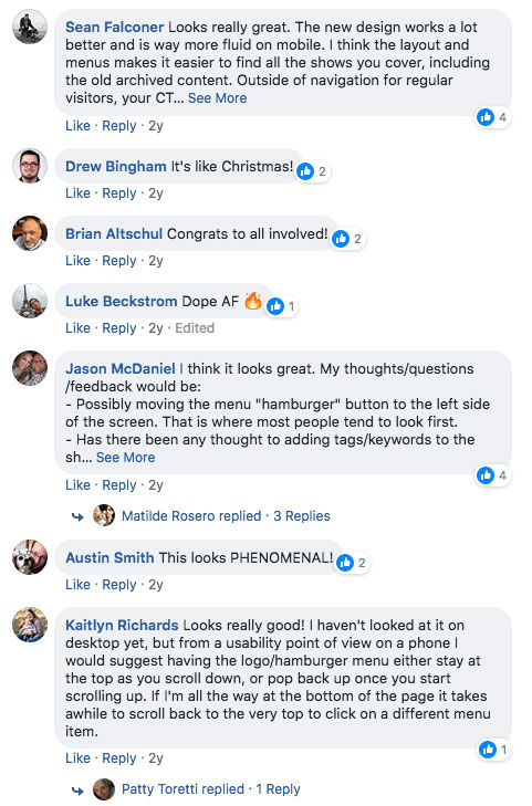
A couple of weeks before launch, we gave the podcast’s patrons access to the staging site, and asked them to use it and give us their input. Overall, the patrons’ opinions were extremely positive. They appreciated being able to find what they wanted, and they liked the new style of the website. A few bugs came up thanks to users’ testing, and we were able to fix them and launch just as the new Survivor season began.
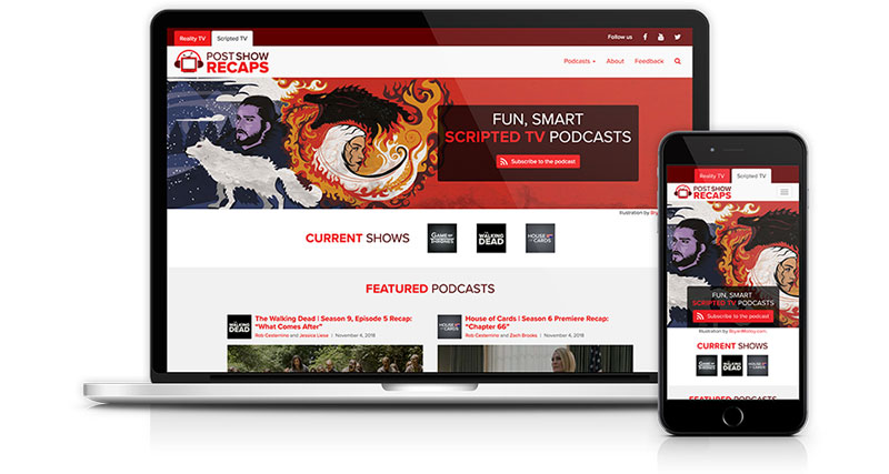
Post Show Recaps
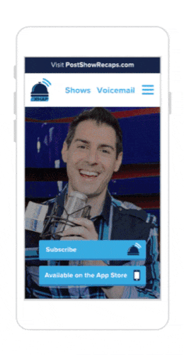
In additional to his network of reality TV podcasts, Rob also runs scripted TV podcasts at PostShowRecaps.com. In the following months we also updated PSR with a similar design.