
Rebuilding a new website for a yoga studio, while taking into account the idiosyncrasies of their work flow.
Yoga Mandir
Yoga Mandir is a very popular local yoga studio. I’ve known the owner, Edgar Ortiz, for a very long time and I am intimately aware of their very specific needs, particularly in regards to their workflow. The website is updated weekly by a staffer that does not have a lot of technical knowledge, and often banners to announce workshops are in different sizes and in wildly different visual styles. For this reasons, I worked to build a backend that would be simple to use, yet minimize the chance of the site losing its visual identity or simply breaking.
User research
We distributed a survey among students of the studio through Facebook and Edgar personally asked students in his classes to fill it out. We found some very surprising facts: some people did not seem to be aware that the website existed, most people usually looked up the information they needed on Facebook, and there were serious issues with people being unable to find something as important as the class schedule, despite the fact that it was linked in the main menu.
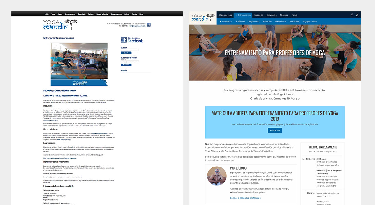
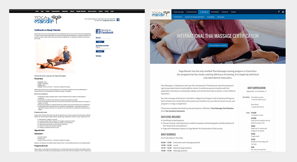
Analytics analysis revealed that the most visited pages were the class schedule, the teacher training section and the thai massage certification. In particular, the thai massage certification got an extremely high amount of international traffic.
Finally, I spoke at length with the staffer in charge of updating the site to gain a better understanding of his needs and of how he went about updating the website every week.
Information architecture and navigation
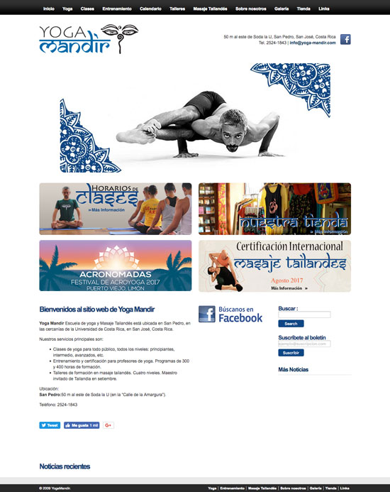
The website has an unusually large amount of content for its kind, and over the years Edgar and his staff had added to it without a plan. As a result, navigation was extremely confusing. I reorganized the contents of the website, and built a menu where users would be able to preview each sections’ subpages at a glance. The new menu allowed the link to the class schedule to be inmediately visible from the home page, on any device.

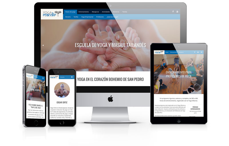
UX/UI design
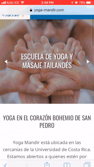
The new design was focused on being accessible on mobile while at the same time delivering a richly visual experience which would help immerse users in the atmosphere of the yoga studio.
A very important part of the process was organizing the large amount of information about courses and certifications, in such a a way that it would always follow a clean, orderly template. In addition, I reworked the content of the thai massage section so it would work better for international users (making it clear that it is a course in Costa Rica and having an English version readily available).
Result
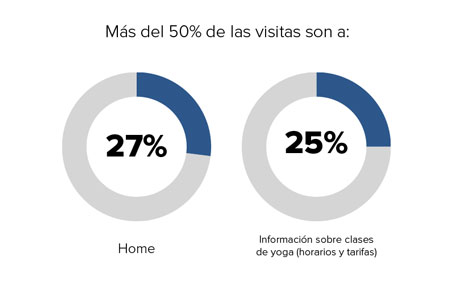
A year later:
- Mobile traffic is up by over 40%
- There are on average 21% more users
- There is a 500% increase in the number of users that find their way to the class schedule page from the homepage