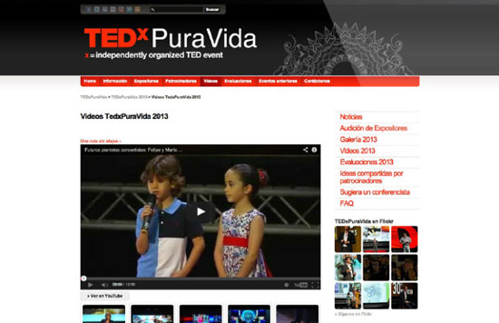
After having designed and managed the website for almost 5 years, the client and I both felt it was time for a redesign.
TEDxPuraVida
 User research
Our initial goals were to make the site fully responsive and to increase engagement by meeting users’ expectations better. To that end, we distributed a short survey among attendees of the most recent TEDxPuraVida event, in order to identify user’s needs and opportunities for improvement, and I analyzed the previous year’s Analytics data and compared it to survey answers.
Insight: despite the fact that 47% of users identified videos as one of the most important features of the site, videos accounted for only 4% of traffic.
From my research, it was clear that the experience of watching the videos needed to be improved.
Aside from video, users identified looking up information on speakers as another very important feature, and of course keeping informed about upcoming events.
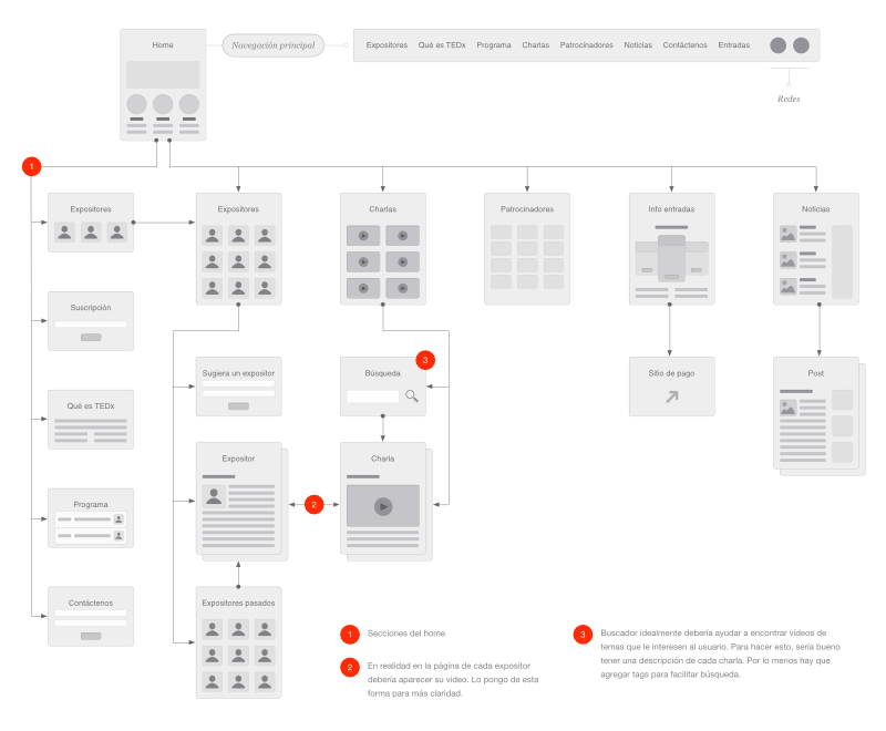
Redefining information architecture
Over 4 years the site had grown in unexpected directions. An important aspect of the redesign was using the previous years’ experience to define a new, more cohesive architecture. I trimmed and simplified the structure based on the insights gleaned from the survey and analytics to achieve this.
UX/UI design
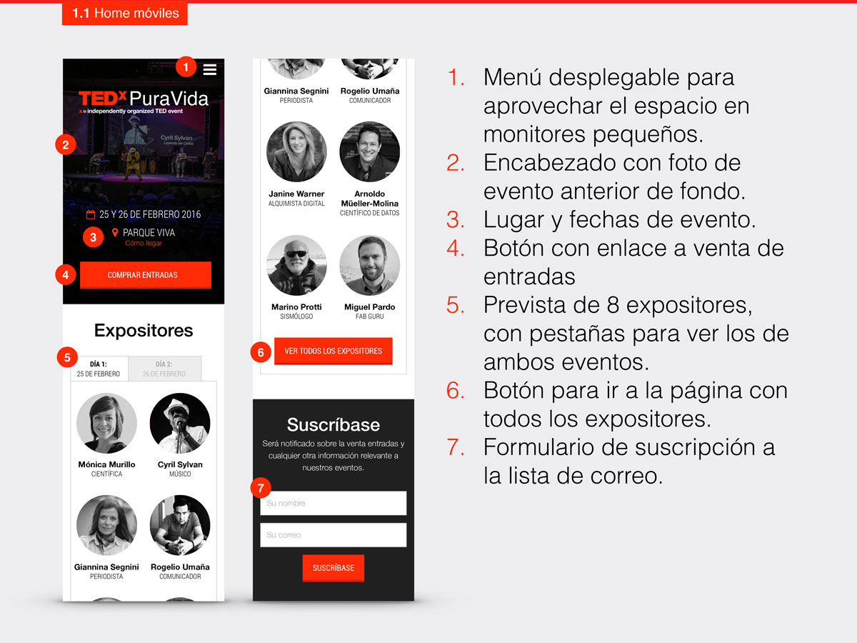
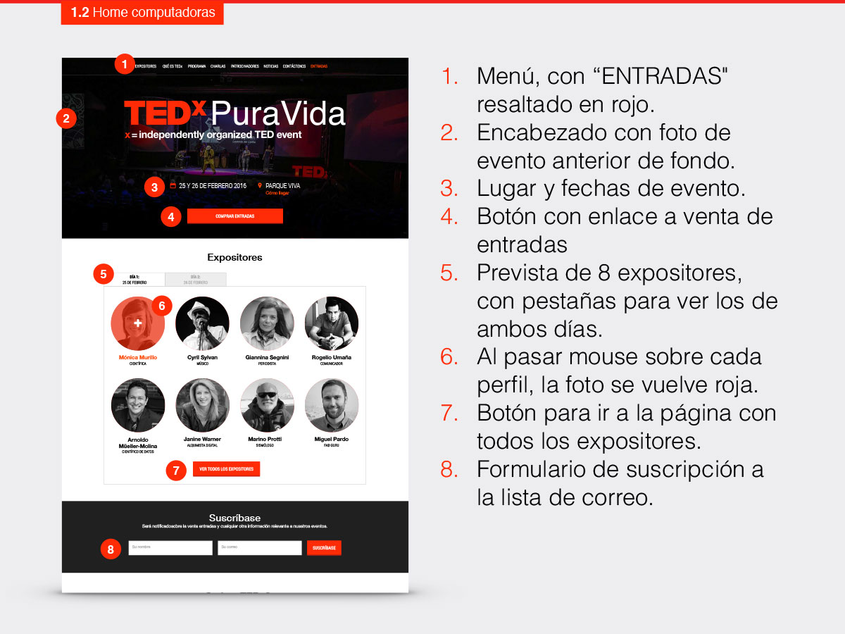
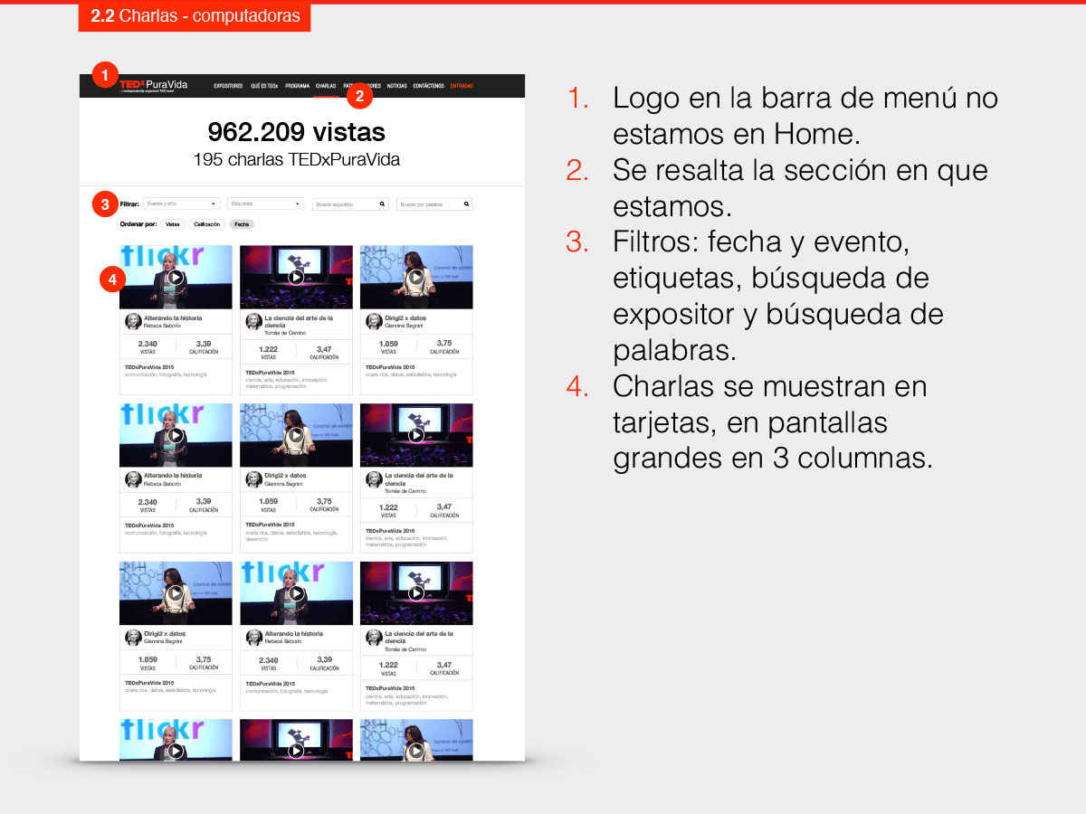
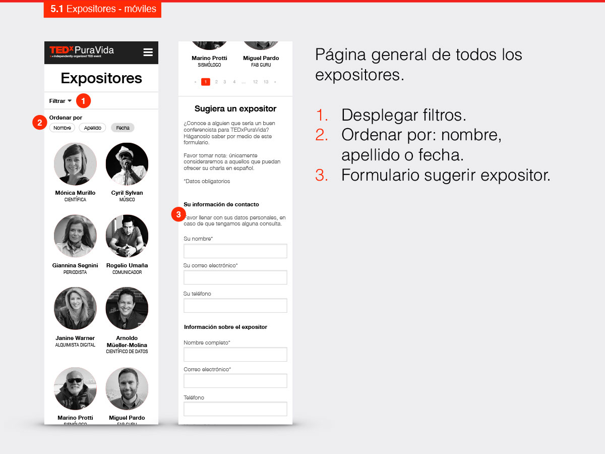
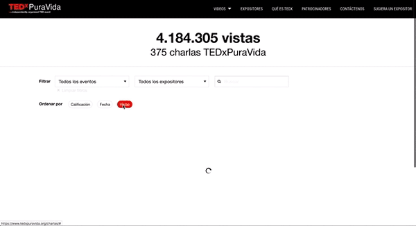
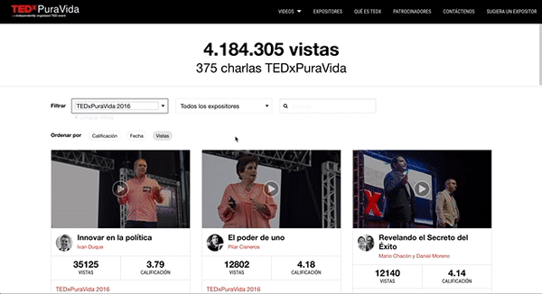
The main focus of the redesign became enabling users to find and watch videos easily. To that end, I defined different ways to filter and sort videos: users can now filter videos by separate events and by speakers, and they can sort by views, rating and recency.
I also designed the website to make sure users could comfortably watch videos wherever they are on the site. If they want to watch a video in a list, such as the main listing, an event page or a speaker’s page, the video will open on a modal window so it can be a more comfortable size. On pages dedicated to a single video, the main video simply replaces its preview image.
Aside from watching videos of previous talks, users stated that being informed about event speakers and upcoming events as the most important tasks of the site. I applied filters and sorts, similar to the ones used for videos, to the speakers page to help users find information. Finally, whenever there are upcoming events, the homepage was designed to reflect that immediately.
Result
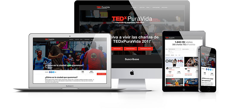
The website is now fully responsive, and it is easier to navigate and find previous events’ talks and speakers.
A year later users spent over 8 minutes on average on pages that include video, while a year before they spent only 1:15 on those pages.